Custom Type for Doug
I made a font for my friend Doug based on an old sign at Pete's Tavern in Manhattan.
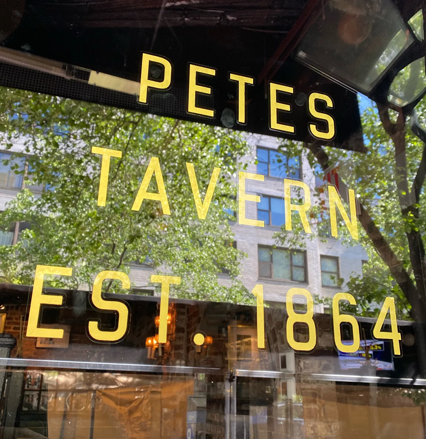
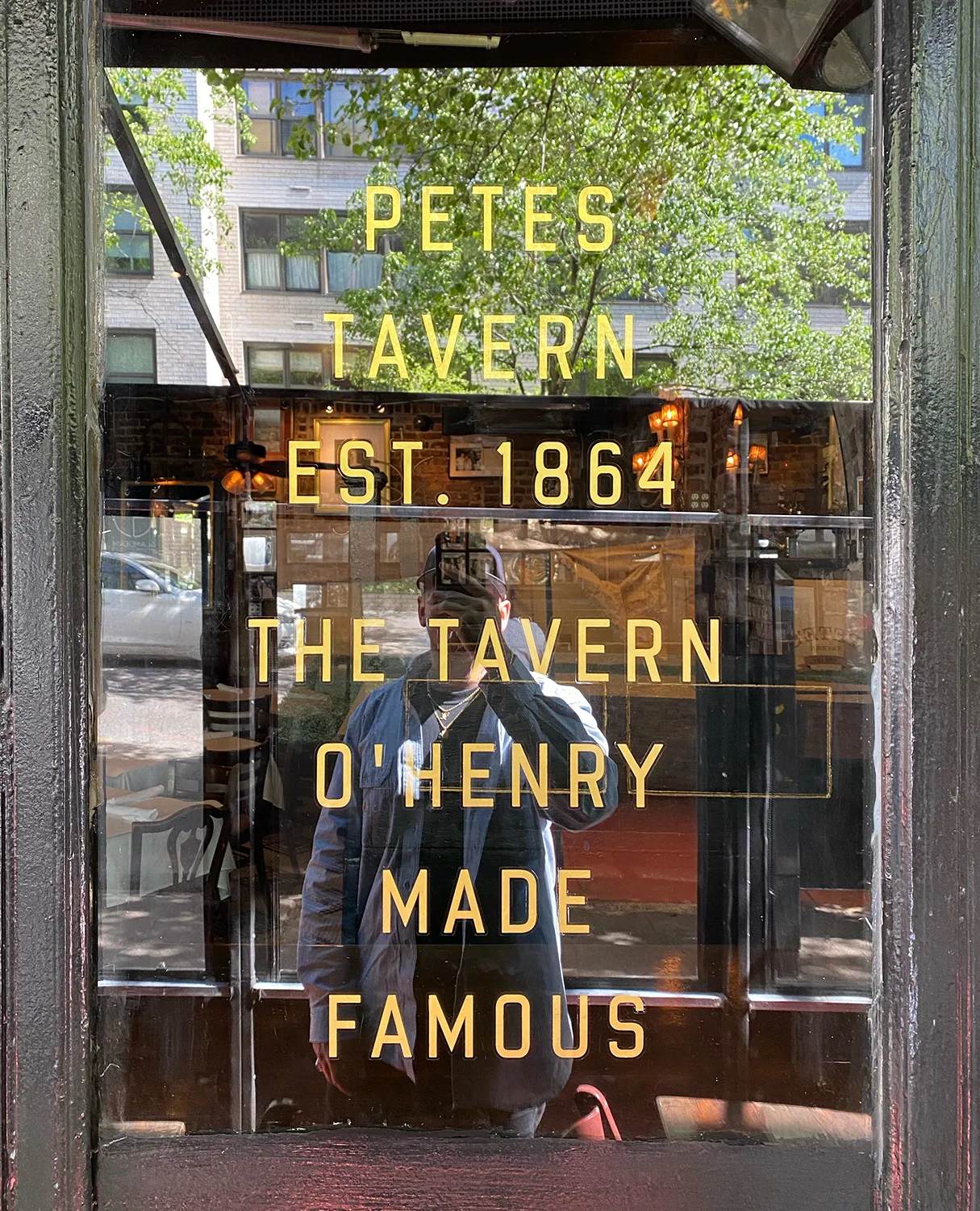
My friend Doug Aldrich called me up about a storefront restoration job he was working on in New York City. He was restoring the window sign for Pete's Tavern. Pete's Tavern is the oldest continuously operating bar in New York City. It's been around since 1864 and the signs needed some love. The windows had a couple of big "PETE'S TAVERN" signs, and then a few of these panels with maybe 5 or 6 lines of copy telling about the bar. The signs were pretty aged and had been repainted so many times that some of the information maybe have been lost over the years, and the letterforms had drifted pretty far from where they started. Doug asked if I could take what was on there and make a font for him to use to layout the signs with a lot of copy.
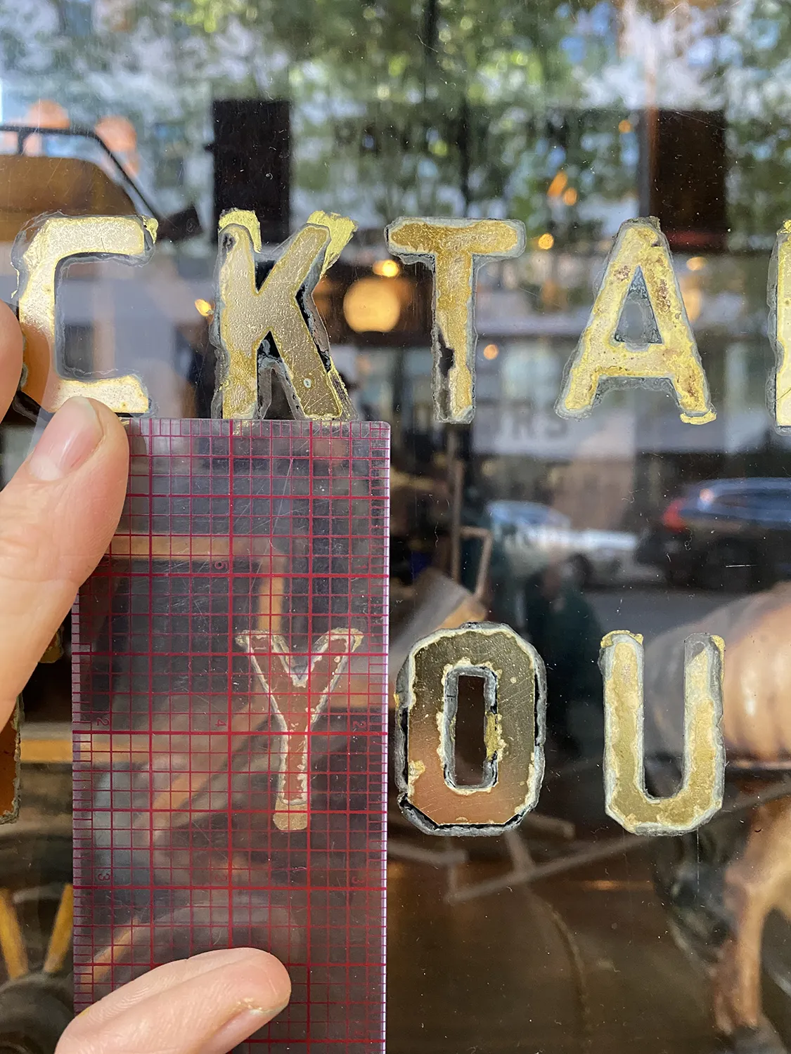
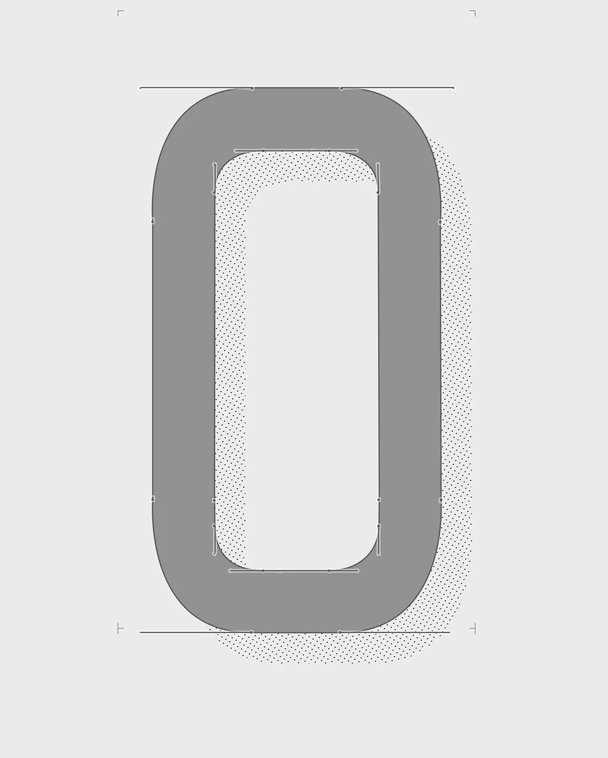
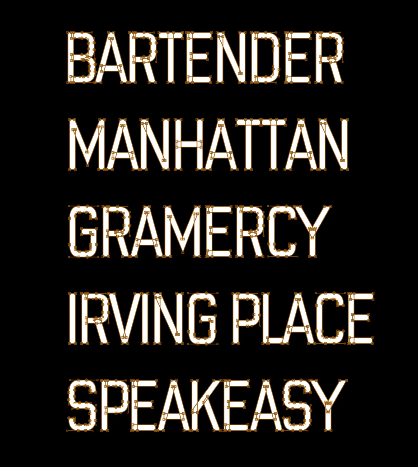
Doug sent me the photos of the signs and I started picking out the DNA of the letters. Picking a stroke thickness, and trying do decipher the original curves and roundness of the corners. They were a mix of "gaspipe" style letters with a little "block" thrown in here and there. This was a pretty faithful recreation of the original shapes, but maybe with a little more consistent letter spacing. For this one I built out the uppercase, the numbers, and a little bit of punctuation. Not a full character set, but enough for Doug to lay out the new signs.
From there he took the font and did this incredible reverse glass gilding for the storefront, It looked like it really fit with the spirit and history of the bar really well. Sorta like it had always been there from the start.
I wonder how many other sign painters had gilded that store front over its 160+ year history? I bet quite a few, and it was so cool to play a small part in this one.I’m planning to put the V.0 font up on my website as a free download, and hope for a full release in the coming years. If you use it let me know!